Airbnb: compare
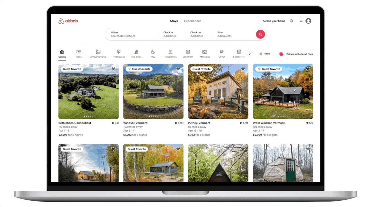
The Compare feature helps users find the perfect stay faster by letting them view and evaluate their top choices side by side on a single screen.
Project type: New feature research and design (end-to-end)
Role: Sole UX Researcher and Designer
Industry: Travel and hospitality
Tools: Figma, Miro, Freeform, Google Forms, Google Sheets
Duration: May 2025 - June 2025
Project Overview:
The Challenge:
Users are feeling overwhelmed with the amount of options they have when it comes to choosing a place to stay. Even with filters, the number of stays could be hundreds and after a while they all start to blur together. It’s difficult to keep track of it all, which leads to frustration and increased drop-off rates.
The opportunity:
How might we help users compare stays more effectively and enjoyably so that they experience less stress and spend less time booking a stay? By doing so, we aim to reduce time on task and boost conversion rates.
The product:
The Compare feature allows users to easily compare multiple stays side by side in one screen. Stays are displayed in a card format that highlights key details such as images, amenities, and total cost, helping users quickly evaluate and choose the best option with confidence.
Understanding Users and the problem
User Research:
User interviews: I interviewed Airbnb users to understand their pain points, needs, and preferences when comparing stays. I asked questions about topics such as their current experience, how they make their decisions, how much time they spend looking for a stay, and what information they find most important when choosing a place.
Usability testing: Prior to designing, I conducted usability tests to assess how users navigated their Airbnb booking process.
I noticed users encountered frustration and decision paralysis when choosing a place to stay due to overwhelming volume of options. The primary methods for saving their top stays were to create wish lists on Airbnb and/or open each stay into individual tabs. Their primary methods for comparing the details of the stays were to write detailed lists or create an Excel or Google Sheet. Attributes/features users typically compared were total cost, number of bedrooms and bathrooms, travel distance to vacation destinations, number of reviews, and rating.


The Opportunity to Simplify the process of choosing a stay
Most users associated positive feelings with travel, but mixed feelings when it came to the planning portion of it. While some felt excited to start planning the details of a trip, others described it as a chore and a tedious task. Some users found it too overwhelming to even start. I saw an opportunity to improve the trip planning experience by helping users narrow down their options and compare key details in one place, without needing to open new tabs or create separate lists.
Qualitative
Feelings associated with choosing a stay.
😃 Excited
💢 Frustrated
😵💫 Overwhelmed
🔄 Tedious
😖 Stressed
⌛️ Procrastination
🪫 Drained
Quantitative
What is your age?
Average age: 28
<20
30
>40
When booking a stay for a trip how often do you book through Airbnb?
Average: 60%
0%
From start to booking, how many hours do you spend looking for a stay?
Average time spent on task: 14 hours
<1
0
50%
10
100%
>20
On a scale of 0-10, how satisfied are you with your booking experience?
Average rating: 7
5
10
The Journey from start to booking
This user journey map illustrates the actions, thoughts, and emotions of a user named Emily as she plans a trip with three friends using Airbnb. It outlines her tasks from the beginning of the planning process through booking a stay, how she may be feeling, and opportunities for improvement at each stage. By mapping out her process, we can empathize with the user’s struggles and design a product that addresses any pain points.
Scenario: Emily is planning a trip with three friends.
Goal: Find and book a stay that accommodates all guests and meets their needs.

Pain Points
1
Time
Users felt they were spending too much time searching through countless options without making progress, leading to frustration and wasted time.
2
Decision Paralysis
Users felt unable to make a decision after considering too many options. They felt stuck by the fear of making the wrong choice and wanted to stop their search completely.
3
Choice Overload
Users were overwhelmed with the number of available stays. The cognitive load required to evaluate multiple choices led to feelings of stress, fatigue, and/or drained.
Competitive Audit
I conducted a competitive analysis of Airbnb’s major competitors, including Tripadvisor, Booking.com, Vrbo, Agoda, HomeToGo, and Expedia, to evaluate what makes their products successful, what could be improved, and what gaps exist.
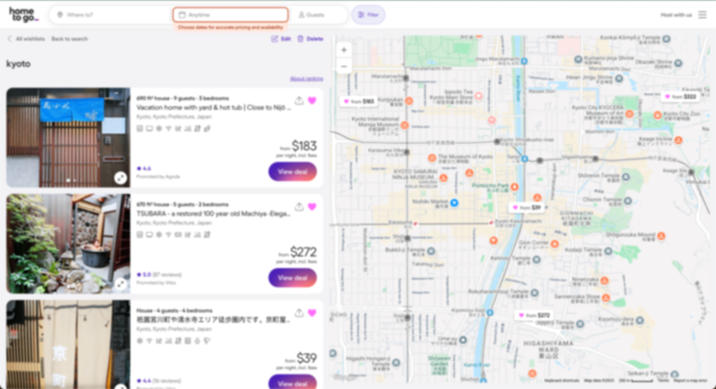


👍🏼 Content is limited to essential information, simplifying the presentation and reducing cognitive load.
👎🏼 Users have no control over which stays are included in the comparison.
👍🏼 Key details are visible at a glance, making it easy to compare options quickly.
👎🏼 The Compare button becomes disabled when the wishlist exceeds five stays.
👍🏼 Content is displayed in a card and grid format making it easy for users to mentally separate and digest the details of each option.
I found that most competitors do not offer a way for users compare their stays and none of them allowed users to choose which stays to compare, making this a strong opportunity for Airbnb to stand out with a Compare feature by addressing this unmet user need for simplicity and flexibility.
Integrating Into the Current Architecture
Interview insights and the user journey map revealed that users typically compare stays by opening multiple tabs or saving listings to a wishlist. To determine the most intuitive place for the Compare feature, I first created a sitemap of Airbnb’s existing information architecture. I then mapped the feature against user behaviors and journey touchpoints to identify the most natural integration point.

Iteration and Feedback
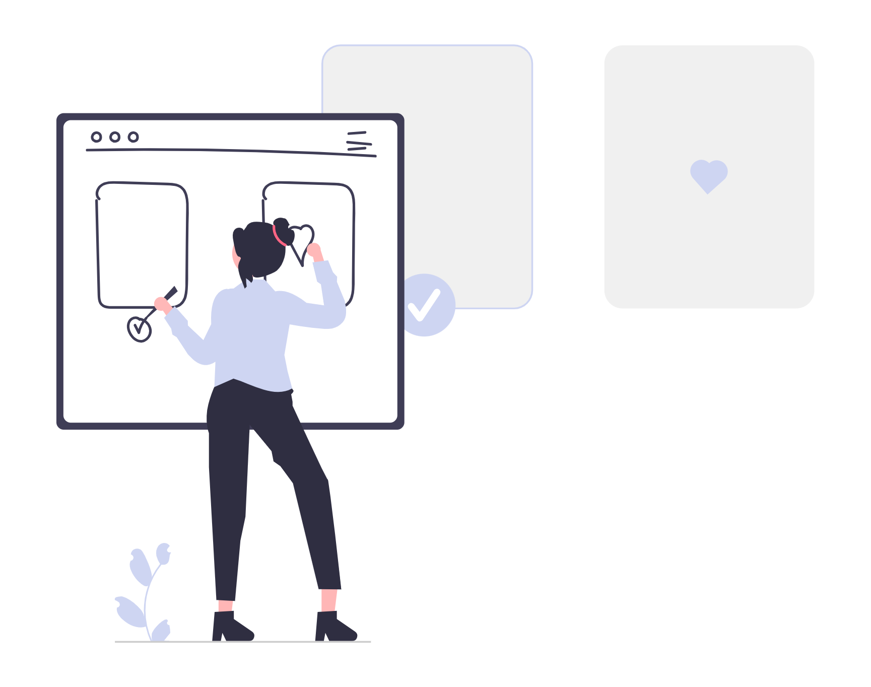
Brainstorming the Comparison feature

After completing the audit, I found that the most effective side-by-side comparisons included all key information in one place, such as a preview image, title, amenities, policies, and cost. I also noticed that many competitors didn’t allow users to choose which stays to compare or remove listings from the comparison screen, revealing a gap in user flexibility. I used the Crazy Eights method to quickly brainstorm layout ideas and developed them into the following rough sketches, which also take into account where this feature would be nested within the sitemap.
Starting the design
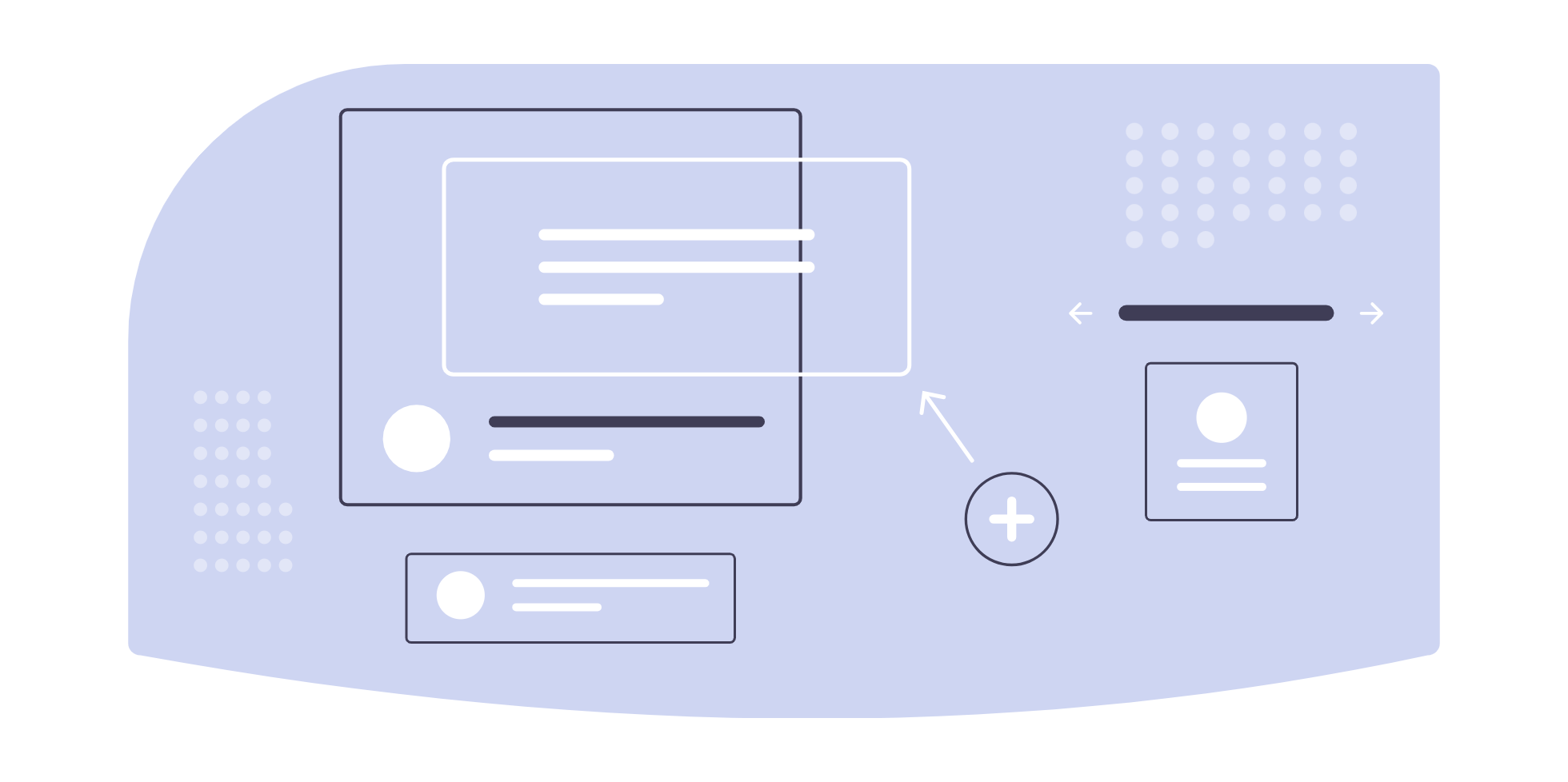
I gathered the ideas from each sketch that best supported the user’s needs and brought them together to create the following paper and digital wireframes.
Paper wireframe
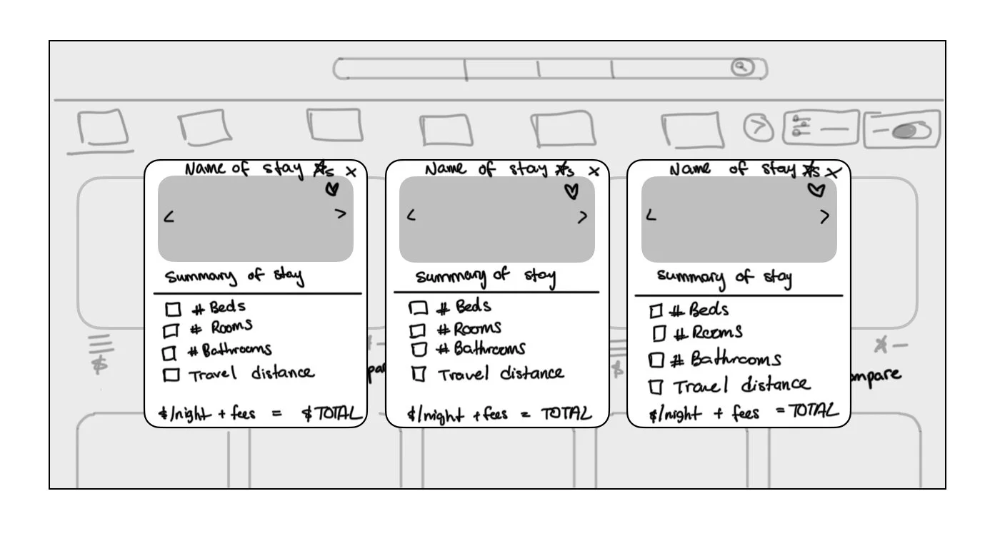
✅ Preview image of the stay
✅ Easy to view card format
Digital wireframe

✅ Arrows to view the photos without leaving the page
✅ Summary of the stay
Low Fidelity Prototype
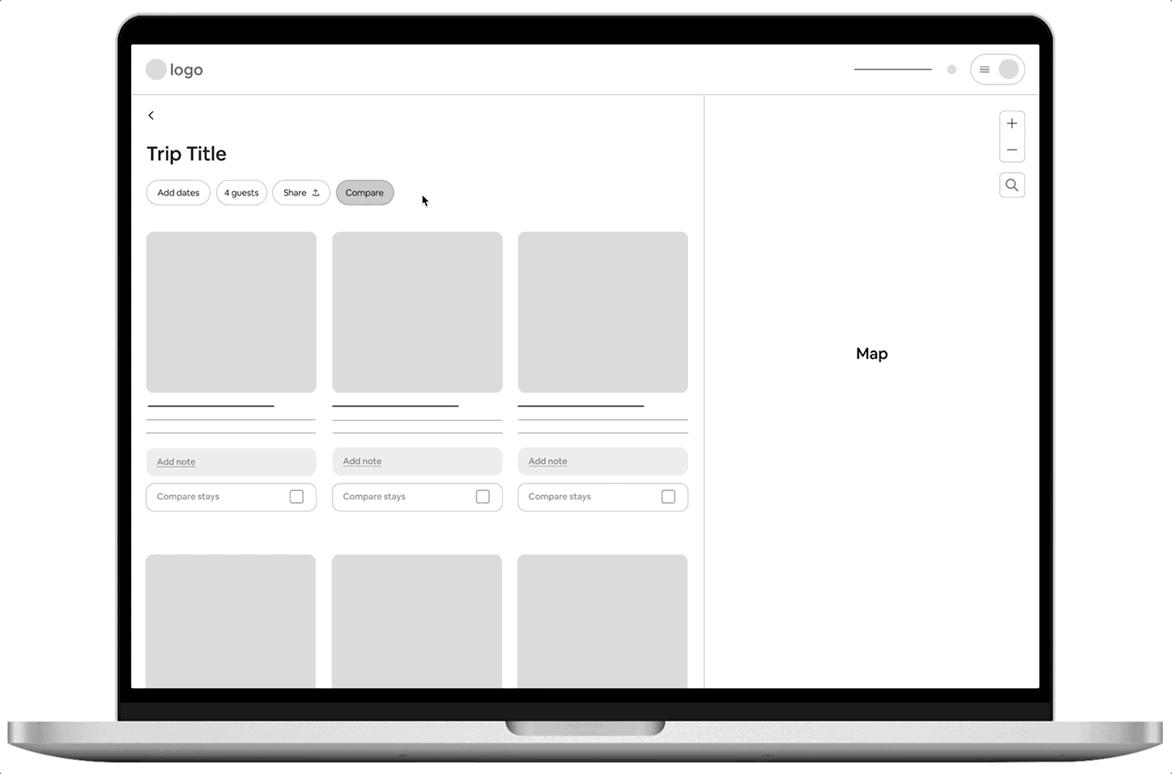
✅ Key details present with cost breakdown
Refining the Design
Second Usability Study
What Changed:
Users wanted to see more of the amenities that mattered to them.
I added a second section that includes additional amenities that are important to the users (e.g. hot tubs, parking, and laundry machines) and separated the content into “Basics” and “Chosen Amenities” for easier browsing.Users were skeptical about the travel distance estimate.
Users appreciated the idea of this feature, but many weren’t sure how the system would calculate distance from the stay to all of their planned activities. To reduce confusion, I removed this feature.Users hesitated to click the “X” to remove a stay.
They were unsure if it would permanently delete the listing from their wishlist so I replaced the “X” with a “Compare” toggle button to reduce hesitation.Users liked being able to compare details side by side.
To make comparisons even easier, I chose to show all relevant amenities across stays and used strikethroughs for any that a stay didn’t include. This helped users quickly see what was missing without having to guess or double-check.
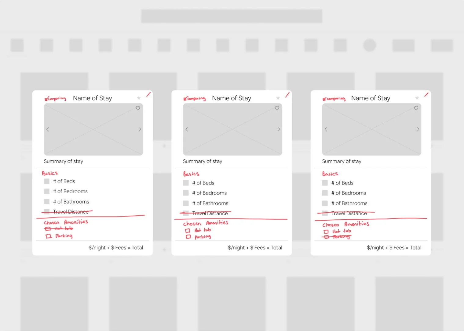
What Stayed:
The summary section helped reduce cognitive load.
It gave users a quick, clear sense of what each stay offered and saved them the effort of figuring it out on their own.Users appreciated the use of icons for key details.
The visual cues made it faster and easier to scan listings and compare features at a glance.
The Final Solution
Compare Feature Guide
While searching for stays, users can “heart” listings to add them to a wishlist. Within the user’s wishlist page, this new “Compare” feature allows them to flexibly select which stays to compare and view them side by side. This reduces user stress, cognitive load, and time spent on the task.
Learnings
Designing within a system keeps experiences consistent.
I learned how to work within an existing design system using Airbnb’s styles, components, and patterns to ensure the new content and layouts felt cohesive with the rest of the site.
Sticker sheets streamline design and simplify updates.
I learned how to create and use a sticker sheet to keep components organized and consistent. By linking elements to main components, I could quickly apply changes across screens, saving time and reducing inconsistencies.

Understanding site architecture is key to feature placement.
Knowing how the site is structured helped me decide where the Compare feature should live. I created a sitemap to better understand the user flow and find a placement that aligned with the overall information architecture.

Early iteration improves usability and saves resources.
I learned the value of testing and refining early in the design process. Running a second usability study after the prototype helped uncover issues before the design became too costly or complex to change.